

Table of contents
let me demonstrate to you with a quick example
p{
     font-size:16px;
}
now, we describe the above code, here we will get font size as property and its value is 16 and its unit is px(pixel).
Some import CSS unit has written below these units are often used in programming
- px(pixel)
- % (percentage)
- em
- rem
- vh
- vw
Absolute Unit vs Relative Unit
Units that are absolute are always the same, no matter where it’s defined.
Absolute Unit
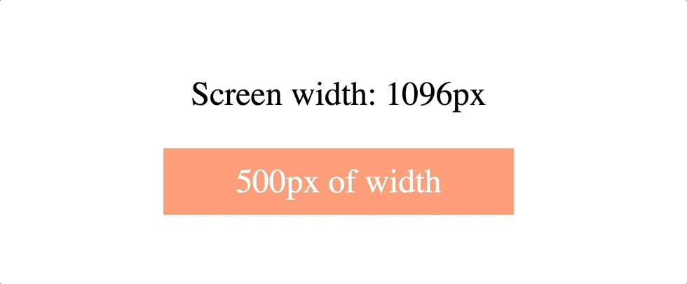
px (pixel)
px unit is the most common or widely used unit in CSS. 1px can be defined as 1/96 of an inch.
cm (centimeter) / mm (millimeter) / in (inch)
If you look at real-world measurements units. These three units might suit you. They are mainly used in printers for the printing industry.
Relative Unit
Units that are relative are based on something, it might be depends upon parent size, your pc font size, current font size etc.
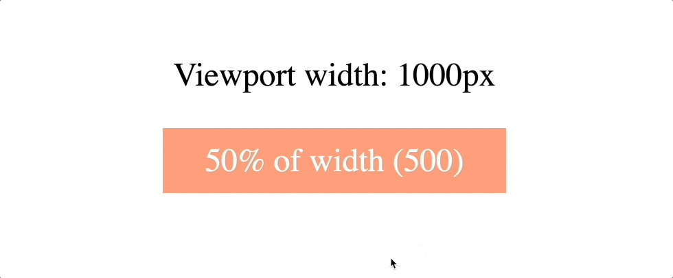
% (percentage)
The most recognizable relative unit. % (percentage unit) is relative to the parent element value for that property.
suppose
body {
 font-size:10px;
}

div {
  font-size: 150%;
  border: 1px solid black;
}
above code has body, and we will give a font size with value 10px then next line has a div has font size with value 150% its mean it will take 150% of 10px means 15px
em
em unit will be relative to its parent font size. For example, if the parent font size is equal to 10px and you set the child font size to 2em. The child font size equal to 10 x 2 = 20px
body {
 font-size:10px;
}

div {
  font-size: 2em;
  border: 1px solid black;
}
rem
Similar to the em unit. the rem unit is also relative to the font size but for the root element which is element. if doesn’t have specific the font-size. The browser will default to 16px.
vh / vw
The rest of the units (vh/vw/vmin/vmax) will be relative to the size of the viewport
vh unit is relative to the viewport height and 1vh is equal to 1% of the viewport height.
vw unit is relative to the viewport width and 1vw is equal to 1% of the viewport width.
vmin / vmax
vmin unit is relative to the viewport of the smallest side either width or height.
For example, 1vmin can be 1vw if the width of the viewport size is less than its height, and 1vmin is equal to 1vh when the height of the viewport is less than its width.
On the contrary, vmax unit is relative to the view of the largest side either width or height. That’s it.
Conclusions
One thing that you should consider is choosing the right unit for your project. if you do need your style to be scalable or responsive. relative unit is your choice. Otherwise, absolute unit.
Hope this article will help you to refresh your CSS unit knowledge 💪🏼